One of the critical elements of painting is, of course, the paint.
But let me help novice painters and save them some money — you don’t need nearly as much paint as you might think. What I mean by that is you don’t need a rainbow of colors packaged in tubes or pans (dried cakes of watercolors) to be able to create a full-spectrum painting.
What you should concentrate on at an early stage is mixing colors, rather than squeezing all colors from a tube.
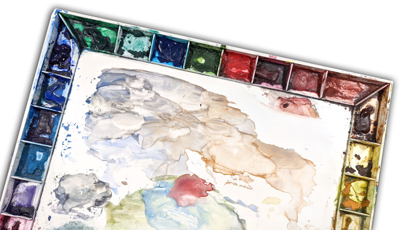
Trust me on this. I spent years – and lots of money – buying little tubes of paint. It was fun and gratifying, and it didn’t help me be a better painter. It helped me empty my wallet and fill up a storage box, while my paintings got more and more confused, strident and muddy.
It is possible to have too much of a good thing, especially early on.
Think of this as any set of skills you learn as part of a sport or craft. If you are learning basketball, there are some fundamental skills you need to work on first, things like learning how to dribble and shoot, before you get into the finer points of dribbling with your off hand, or learning how to shoot from half court. The basic skills form a foundation on which you can build your game.
Color is actually one of those fundamental skills, no matter what the medium. And the basics can be boiled down to three colors – red, blue, and yellow.
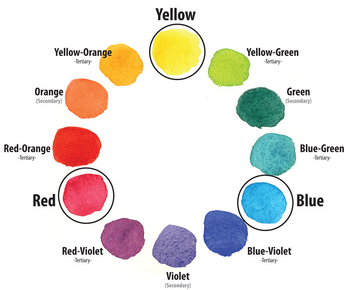
Yes, just like you might have learned in elementary school. The primary colors.
From the primary colors, you can mix a second set of colors, the secondary colors: orange, green and purple.
And then, by mixing a primary color with an adjacent secondary color, you can fill in the gaps in the color wheel with tertiary colors (yellow-orange and red-orange, for example).
Depending on the pigments you choose as your primary colors, the resulting wheel may look different. If you have struggled with mixing colors in the past, start with the mixing primaries, as noted on the color-wheel graphic, and you might have better results and cleaner color. A good choice for a mixing “Red” is Permanent Alizarin Crimson (available in most brands). A good choice for a mixing Blue is Holbein’s Peacock Blue, or W&N’s Winsor Blue (green shade). You might also look for watercolor sets that are advertised as “Mixing Sets” because they will probably include a red and blue that will be good matches.
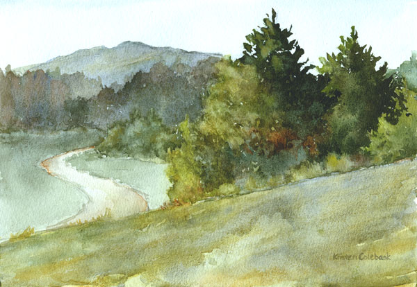
However, before you get wrapped up in finding a perfect set of primaries, my main point is that it’s still better to mix many colors as they will be more naturalistic and add subtle variety, especially if you work in landscape. There are many options for red, blue, and yellow. Some are “cooler” and some “warmer”, some are transparent and some opaque. I could drone on and one about the characteristics of pigments (I’m quite interested in those characteristics and devote time to that topic as a painter), but bascially I don’t need a tube of green paint to mix a green color for my painting. I can mix a lot of different greens because I keep a variety of primary options on my palette.
With that arsenal of choices, I can mix a lot of different greens, and they will look more natural in my landscape painting than my tube of vivid green can ever match.
Next time, we’ll dive back into paint colors and the color wheel, and talk about mixing complementary colors…